Monday, March 27, 2017

Week 9A

Today in class we started out by going over CMS (Content Management Systems) and how they are used.

Next we had in class work time to get started on our homework and meet with Pannafino to talk about our Visual Inventory.

Alina and I started working on the Personas first, we came up with three different ones; two that are looking to adopt and one that is looking to foster.


When we talked to Pannafino about the visual inventory he said

Wednesday, March 22, 2017

Week 8B

Today during class we started out by going over a few terms and then watching a short video that went along with our reading, "Visual Inventory." After that we had the rest of the class time to work on creating our own visual inventories. Alina and I both worked on finding different sites that are what we are going for as far as tone, color, and concept. Below you can see screenshots of some of the sites we found along with the links to see more.


Tone:

https://littlepudsandco.co.uk/


http:/packdog.com/preview


https://www.whistle.com/


Color:

http://www.postable.com/


http://originalterritory.com


www.departika.com


Concept:

http://www.onehappycampernj.org/


http://www.nolowenenowak.com


http://www.drap.agency/

Week 8: Outside the Classroom

Homework from 8A:
  • Read Visual Inventory by Dan Mull
  • Call non-profits and ask about site

Calls:


KPETS:

I called KPETS to talk about their site and the person I talked to did not directly design the site but helped with the content that appears on it but even then I got some pretty good answers. At first I asked who visits the site most often and her response was that most of the time people who are looking to volunteer but they also get a good amount of people who are interested in what they do because they want to use their service, a few people who contact us are also interested in signing their pets up to become a therapy pet but that doesn't happen too often.

If you could change anything about the site, what would it be: she had to think about this a little but then told me she feels it could be organized a bit better, there is a lot of information on the site which is great but it could be better organized.


Pet Guardians:

I couldn't find a number for Pet Guardians so I sent them an email (only form of contact I could find) but I haven't heard from them yet so I checked out their website again and made a few assumptions based on what I saw.

Who uses it the most: people who are looking to adopt animals or volunteer

Why: they want to know more about the organization and how they can help, even if it's in  a different way than adopting a pet

What would you change: create a more structured layout and use better graphics (mix of photos and illustrations)


Homework from 8B:


  • Visual Inventory in InDesign (Alina and I split the work, we are each doing six)


Monday, March 20, 2017

Week 8A

Today in class we started out by going to Jerry's 144 class and mentoring a student for about 20 minutes. The student I paired up with was named Brenna. The project they are working on is creating their own trading cards. Brenna is creating her's around natural wonders of the world. Along with her cards she also created a little box to put them in. As we were looking at her cards she did have a few questions on how to make her images better. I suggested adding a few gradients here and there and maybe some more line work to add in detail but also keep the graphics simple. We also talked about when kind of paper she should print on and we both agreed a then card stock style would be best.

After that we went over  the next project which is creating a website for a non-profit organization.
Alina and I decided to work together for this second project so instead of three pages we need five for the final project.

We looked up and researched a bunch of different local organizations and finalized it to couple different ones to choose from:


  1. Aaron's Acres
  2. Marietta Restoration Association
  3. Pet Guardians
  4. KPETS
  5. Leg Up
Now we just have to decided which one we want to design a new website for!

Wednesday, March 8, 2017

Week 7B


DAY OF FINAL CRITIQUE

For my final critique, a lot of the comments were what I figured they would be. Changing the font faces on the header and adding in the 21+ age limit to the header. I knew the comment about the font would come up. I'm not very good at picking the right font or pairing fonts up.

I also misspelled Donut on the original header...but I fixed it!


On the header the date and time are a bit to close to the side so that's just a matter of bringing them in more.

I also had a few comments on incorporating a little more creativity to my page such as creating my own map for the Contact page, adding color to the graphic on the homepage along with the icons.

I also had a comment about using the cursive font I used for headings a bit more throughout the page but also watching the different colors I used. I colored each header differently to sort of play off the colors of the sprinkles in the header but I can see how it didn't work as well as I thought it may.

I think I am definitely going to keep playing around with my webdesign for this event. I had fun playing with it and the comments I got during my critique helped me come up with some new ideas for what I have.

Week 6: Outside the Classroom


Over the weekend I worked on creating a new header, adding in links for hotels, and creating the contact page which also had an interactive map from Google Maps.


I listed the names of each hotel along with photos and then added buttons to take you to their booking page. While the event is only four hours, because there is alcohol being served and some people may come from a little further out, I thought adding in an option to spend the night somewhere would be a good idea. (I later scratched this idea)


On my contact Page I had the address of the location of the event along with an interactive map from Google Maps. Below it was a submission form for any questions, comments, concerns, etc.


Week 7A

During class I worked for the first hour or so on my website and then met with two people to critique each others' webpages.

I met with Sam and Leah.

This is what Sam had to say:
  • Create a larger header (the one I had originally was a little small she felt)
  • Incorporate more color into my design.
  • Photo gallery-> rearrange into a slide show
This is what Leah had to say:
  • Work on my spacing a bit, While things are spaced out, I could add in a little more white space to break things up a little more
  • She also commented on adding more color to my page.


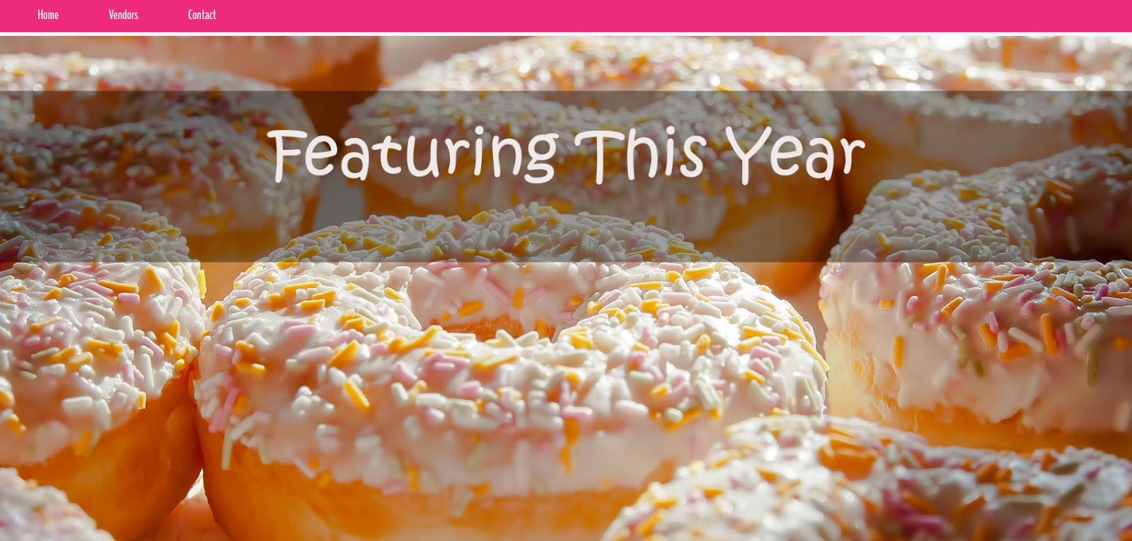
So this is what I had at the end of class.


New header, a bit larger than the last.


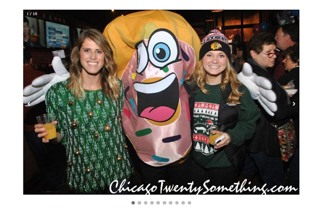
I incorporated a slide show of images from the last Donut Fest onto the home page.


 I also created a footer (icons non-functional). I wanted the pink to look like icing and added a donut color as the base. I used the same pink as the nav bar from the top to tie them together.


For my vendors page I used the logos of each one as a link to their site. Later I added text underneath each one restating their name since a few of them are a little hard to read.


I also created a header for the Vendors page.


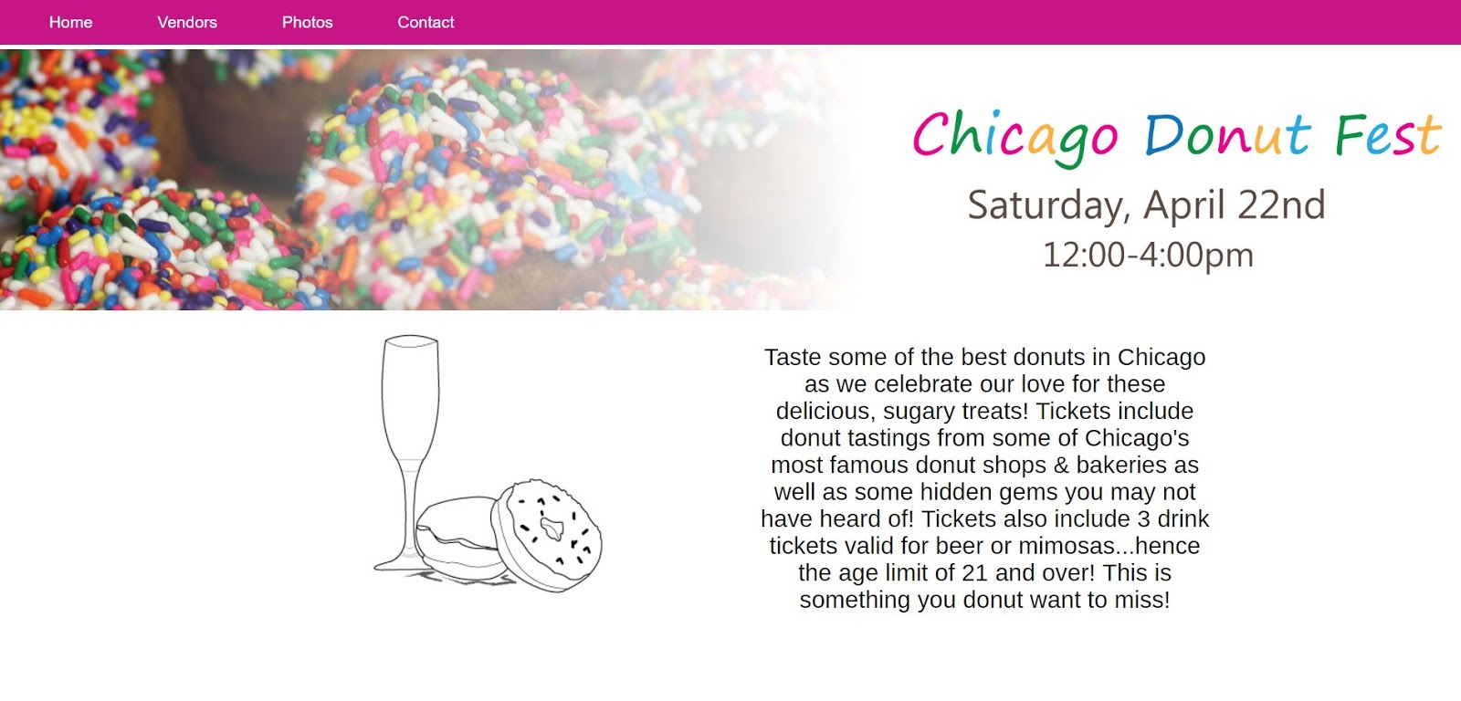
Last but not least I touched up the intro paragraph and added a button to purchase tickets.

Week 6B

I was not in class this day. I had some technical issues with my laptop and had to take it to Geek Squad so I was without my laptop for almost three days.

I mistakenly did not back up my files on my USB and therefore could not continue working on my site. Lesson learned.

Remember to always back up your files!

Week 6A


Week 5: Outside the Classroom

For homework we needed to work on coding the homepage of our website and have about 25% of graphics done for it as well.

This is what I have so far:


I am also going to have a page for Photos, Vendors, and a simple contact page with a map of the location.

The simple icons you see are for the freebies that are being handed out during the event.

Where you see the grey block under the header I want to put an illustration of some donuts and either a champagne glass or beer bottle since there will be mimosas and beer being served at the event.